
How to Use the U.S. Automotive New Vehicle Sales and Market Share Dashboard
Track monthly U.S. new vehicle sales and market share with this interactive dashboard from Foureyes. Compare brands, body types, and regions to uncover sales momentum, competitive shifts, and supply dynamics—updated monthly and available for free.


Understanding how sales shift between brands, body types, and regions is critical for anyone watching the U.S. auto industry. The U.S. Automotive New Vehicle Sales and Market Share Dashboard makes it simple to track these changes month-over-month, providing a clear view of which brands are gaining ground, which are losing share, and where sales momentum is building.
This free, interactive dashboard is powered by the Foureyes inventory dataset, which collects VIN-level merchandising data from over 20,000 U.S. franchise dealership websites daily. By tracking when vehicles appear and leave dealership websites, then resolving for dealership trades, we can reliably estimate monthly sales and calculate market share across brands.
Whether you’re a dealer benchmarking your dealership against competitors, an OEM analyzing regional shifts in demand, or an analyst tracking how body types perform over time, this dashboard gives you the timely, high-level insights you need in one place.
In this article, we’ll walk through each section of the dashboard, define the terms used in the dashboard, and answer some frequently asked questions. If you have additional questions, you can always contact us.
Monthly New Auto Sales
At the top of the dashboard, you’ll find the Monthly New Auto Sales chart. This view highlights how many new vehicles were sold each month over the past 12 months.
If you want to know more details on a given month, hover over that month’s dot on the line. It will show the daily sales curve for that month.
If you want to explore one or more specific brands, you have two options. First, you can use the brand filter directly below the chart to dynamically adjust the data:
- To select one make, simply click the name.
- To select multiple, specific brands, hold down Ctrl (Windows) or Command (Mac) while clicking.
Or two, you can use the Brand and Body Type Filters. In the brand box, click the arrow to see all the brands in a drop-down list. Unselect any brands you want to exclude, or unclick “All” and then select only the brands you want. Be sure to click “Apply” when you are done so your selections are applied.
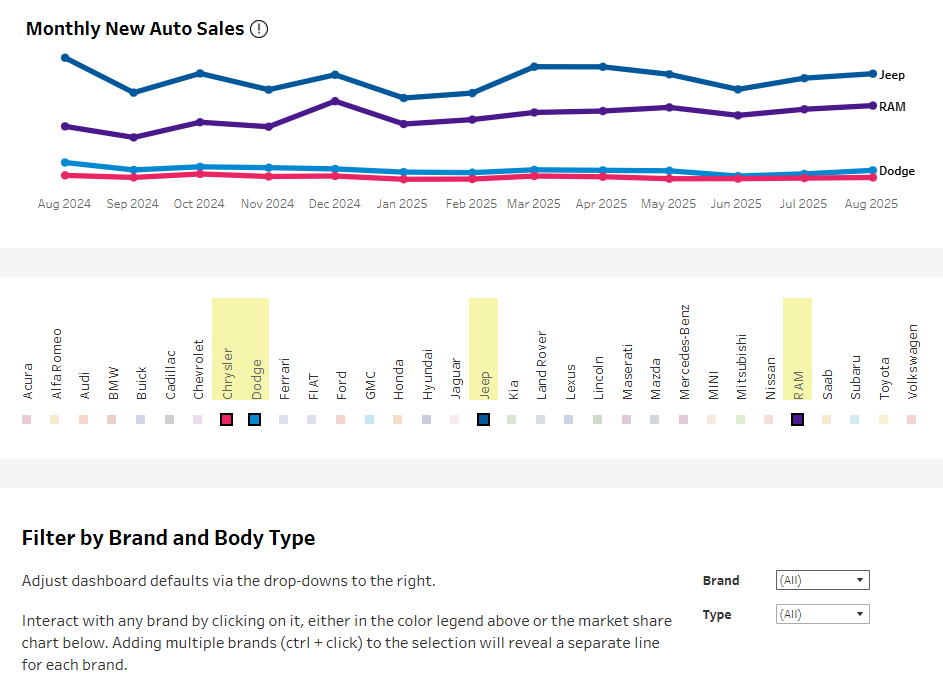
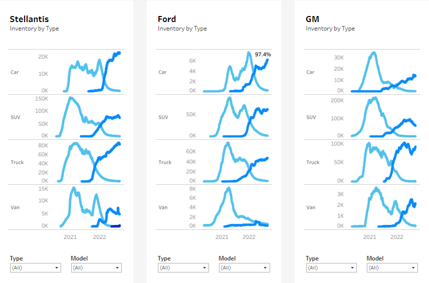
Follow this same process if you want to see the data by Type (e.g., car, SUV, truck, van), or by Brand and Type.
Your selections here filter all the way down the page, including the Market Share, Median Daily New Inventory, and State-level sections. This is so you can keep analysis consistent across the full dashboard. To look at the full dataset again, simply refresh the page, or use the “Reset View” button at the bottom of the dashboard.
By filtering by brand or type, you’re better able to spot sales momentum. For example, you can see which brands are climbing in sales volume after new model releases or incentive campaigns, and which are trending down month to month.
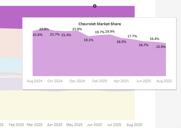
Market Share of Sales by Brand
Beneath the sales trendline, the Market Share of Sales by Brand chart shows how sales are distributed across manufacturers. Each color band represents a brand’s share of total sales for the month.
Market share offers a direct lens into competitiveness. If a brand’s share grows steadily, it may reflect strong supply, attractive incentives, or rising consumer preference. Shrinking share, meanwhile, can signal challenges with inventory, pricing, or marketing effectiveness.
If you’d like more information on a specific brand, hover over its colored bar to see its market share percentages for the year.
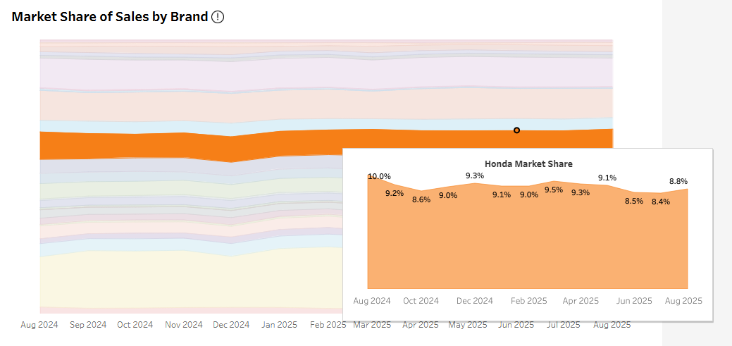
Remember, the above filters allow you to narrow your view by both brand and body type. For instance, if you’re interested to see if the market share for trucks is changing, select “Truck.” The view will change to only show brands selling trucks, and clicking deeper shows the details of that trend for trucks within the brand.
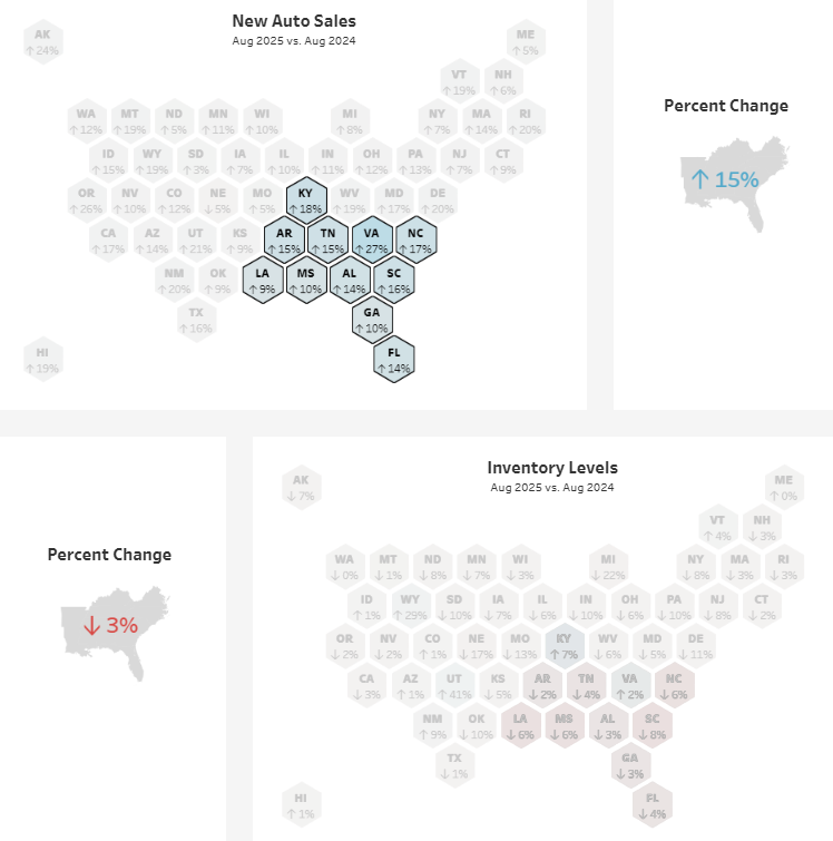
State-by-State Sales and Inventory Changes
The lower half of the dashboard brings in regional insights through side-by-side state maps:
- New Auto Sales by State: Shows which states saw sales growth or decline compared to the selected time period.
- Inventory Levels by State: Tracks how supply changed across regions, helping you understand if shifts in sales are tied to availability.
- Percent Change Summaries: Quick reference boxes summarize total U.S. sales and inventory changes so you can see the national picture at a glance.
Hovering over any state will provide you with details by brand. Clicking on any state will filter the rest of the dashboard to that geography. If you’re interested in a specific region, select multiple states using Ctrl + click to easily compare specific regions to the national trend. This will also update the percent change reference boxes.
Toolbar and Usability Features
It's easy to miss a small white toolbar running along the bottom of the dashboard, but with it you can:
- Undo or redo actions
- Reset the view
- Refresh data
- Pause or replay animations
- Download charts (Image, PDF, PowerPoint)
- Enter full screen

Glossary of Terms
Monthly New Auto Sales
The total number of new vehicle sales across U.S. new franchise dealerships, tracked monthly.
Market Share
A brand’s percentage of total U.S. new vehicle sales in a given month, calculated by dividing that brand’s sales volume by total sales across all brands.
Median Daily Inventory
The midpoint of daily new vehicle inventory observed during a given month, providing a balanced view of supply across the period.
State-by-State Sales
Monthly new vehicle sales volumes broken down by state, allowing for regional comparisons.
Percent Change (Year-over-Year or Month-to-Month)
The difference in sales or inventory levels compared to a previous period, shown as a percentage increase or decrease.
Frequently Asked Questions
Q: How does this dashboard compare to OEM or government sales reports?
A: While OEM and government reports provide official figures, they are often published with significant delay. This dashboard gives a near real-time perspective using a consistent methodology applied across all brands.
Q: Why track market share monthly instead of quarterly?
A: One of the advantages of Foureyes data is that it is more timely than traditional quarterly or annual reports. By reporting monthly, users get a more timely view of brand competitiveness and consumer preference shifts. By clicking into the data, you can engineer quarterly views. Or you can subscribe to Foureyes inventory data to get the exact timeline you want, down to daily or going all the way back to January of 2020.
Q: Which brands are gaining the most market share right now?
A: Market share shifts monthly, and trends differ by region and body type. Check the live dashboard to see which brands are climbing nationally or in specific states. It’s free, updated monthly, and doesn’t require a login.
Q: What can regional sales data reveal?
A: State-level sales data highlights geographic differences in consumer demand. For example, SUVs may dominate in some regions. Or it can show temporary explanations for drops in performance. For example, a powerful hurricane in the Southeast could temporarily reduce inventory and sales in a cluster of states, explaining away a perceived downturn.
Q: Do analysts use this dashboard for forecasting?
A: Since the Foureyes Sales and Market Share Dashboard is free and requires no login, we don’t know the users. However, analysts across financial and predictive disciplines do subscribe to our inventory data to track month-to-month sales momentum, market share shifts, and regional variations to inform demand forecasts, identify early signals of consumer preference changes, and support valuation models. To learn more, contact us.
Q: What role does inventory play in shaping sales trends?
A: One driver of growth or decline can be supply constraints. We show supply data at a state-level side-by-side with sales to help analysts distinguish demand-driven changes from supply-side bottlenecks.
Q: How do incentives or new model launches show up in this data?
A: Spikes in monthly sales or increases in market share often reflect the impact of incentives, promotions, or new model introductions. By watching for these shifts, you can measure the effectiveness of market activity in near real time.
Q: Can I share insights from this dashboard?
A: Yes. You can cite the Foureyes U.S. Automotive New Vehicle Sales and Market Share Dashboard in your work, presentations, or media coverage. Please include a link back so readers can access the live dashboard. For media inquiries or comments from Foureyes, please contact us at hello@foureyes.io.
Read More Blogs
 Data Study: How Many Leads Does it Take to Sell a Car in 2026?
The average new vehicle takes 3.3 leads to sell. EVs and performance models take far more, work trucks and mainstream crossovers far less.

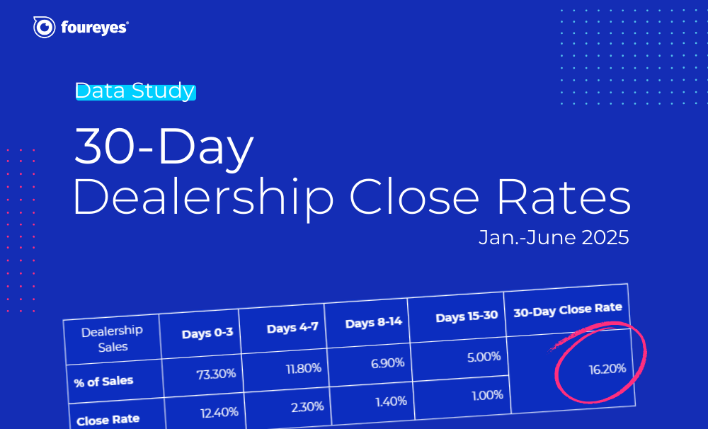
 Dealership Close Rates by Metro: And Why Contact Rates Matter
Foureyes tracked 2.6 million leads from more than 1,150 dealerships across 48 U.S. markets through Q1 2026 to dig deeper into dealership close rates by metropolitan area. One surprising finding: the correlation with contact rates.

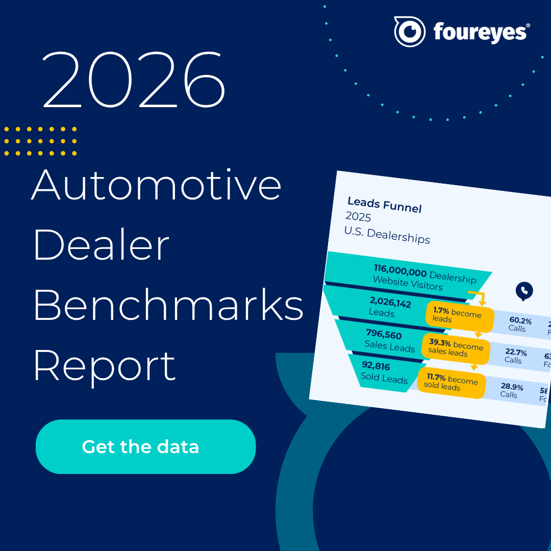 2026 Automotive Dealer Benchmarks Report
For the eighth year, Foureyes analyzed dealer website data to identify industry benchmarks, so you can compare your dealership’s performance and see what it takes to stay competitive.
 Data Warehousing for Auto Dealerships: What It Is, Why It's Hard, and Why Your CDP Makes or Breaks It
Data warehousing comes up constantly in dealer group conversations, but the actual mechanics rarely get explained clearly. This post tries to fix that. By the end you'll know what a warehouse actually does, why so many groups struggle to get it right, and why the data going in matters more than most people talk about.

 Foureyes Launches Snowflake Managed Services, Taking the Complexity Out of Data Warehouse Management for Dealer Groups
New offering gives dealer groups the warehousing expertise they need — without building and managing it themselves
.webp) Foureyes and Volie Announce New Integration Partnership to Boost BDC Performance
Foureyes and Volie Announce New Integration Partnership to Boost BDC PerformanceFoureyes and Volie announced a two-way integration partnership that connects audience-building and dealer data infrastructure with tools for dealership BDC teams.
 New Foureyes Consent Management Passes 100-Vendor Milestone, Signaling Industry Standardization Around Dealer-Controlled Consent
Foureyes today announced that more than 100 automotive retail vendors are now participating in Foureyes Consent Management, marking a major step toward standardizing how customer communication opt-out requests are managed across the industry.
.png) Introducing Foureyes Connect: A New Standard for Automotive Data
Introducing Foureyes Connect: A New Standard for Automotive DataFoureyes today announced the launch of Foureyes Connect, a different kind of data platform designed to reset how dealer groups operate and scale in an increasingly complex automotive retail landscape.
 How to Use the U.S. Auto Prices Over Time Dashboard
Explore weekly U.S. auto pricing trends with Foureyes’ interactive dashboard. Compare new and used prices by brand and body type, track inflation and tariff impacts, and uncover insights to guide smarter decisions.
 How to Use the U.S. Automotive Inventory Over Time Dashboard
Track how U.S. auto inventory has changed since 2021 with this interactive dashboard. from Foureyes. Compare new vs. used, explore brand and model shifts, and gain insights to guide smarter pricing, stocking, and forecasting decisions on a weekly basis.
How to Use the U.S. Automotive New Vehicle Sales and Market Share DashboardTrack monthly U.S. new vehicle sales and market share with this interactive dashboard from Foureyes. Compare brands, body types, and regions to uncover sales momentum, competitive shifts, and supply dynamics—updated monthly and available for free.
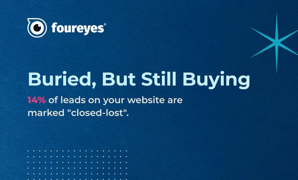 Data Study: The Leads You Marked as Lost Are Still Shopping
New Foureyes data shows why “closed-lost” doesn’t mean game over – and how dealers can win more with what they already have.
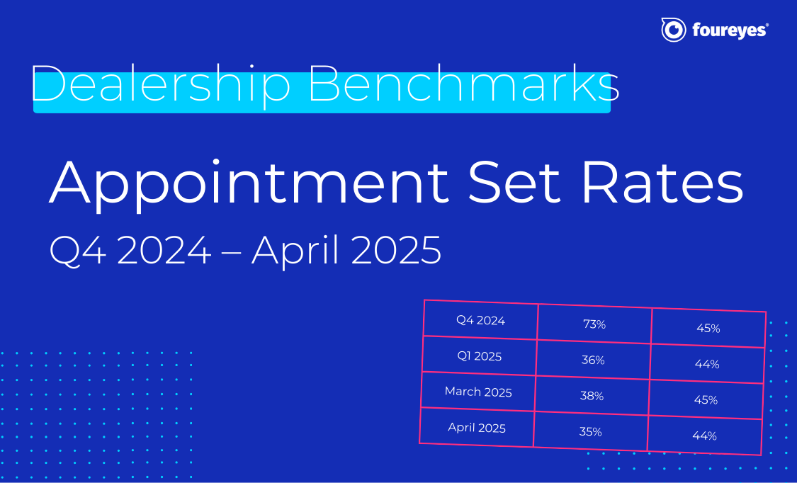 Automotive Sales Benchmarks: Appointment Set Rates for Q4 2024 to April 2025
If your dealership's appointment set rates feel like a mystery, you're not alone. But now, there's fresh data to show where you stand.
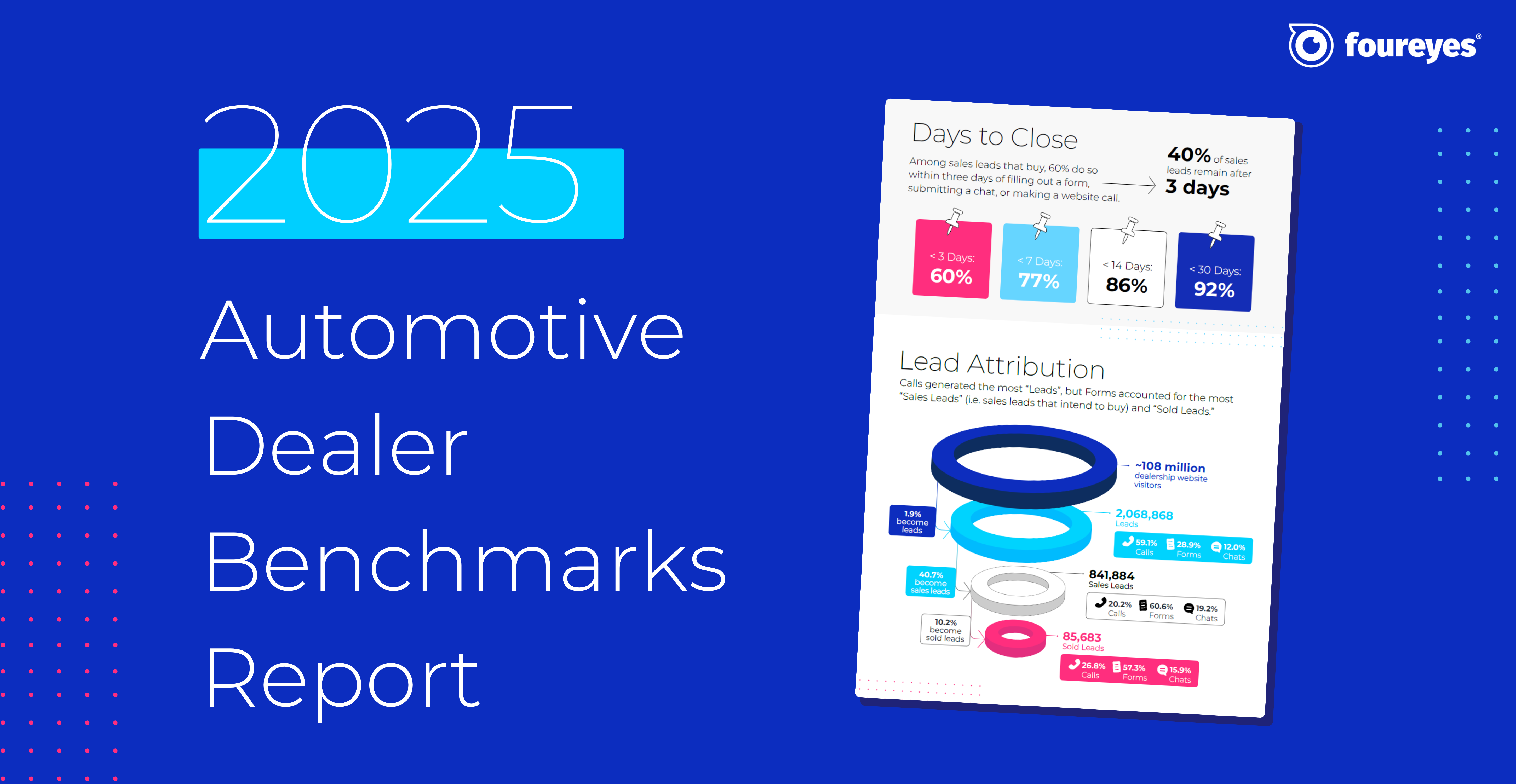 2025 Automotive Dealer Benchmarks Report
For the seventh straight year, Foureyes has dropped its Automotive Dealer Benchmark Report – pulling back the curtain on what's really happening with your leads throughout your sales process.
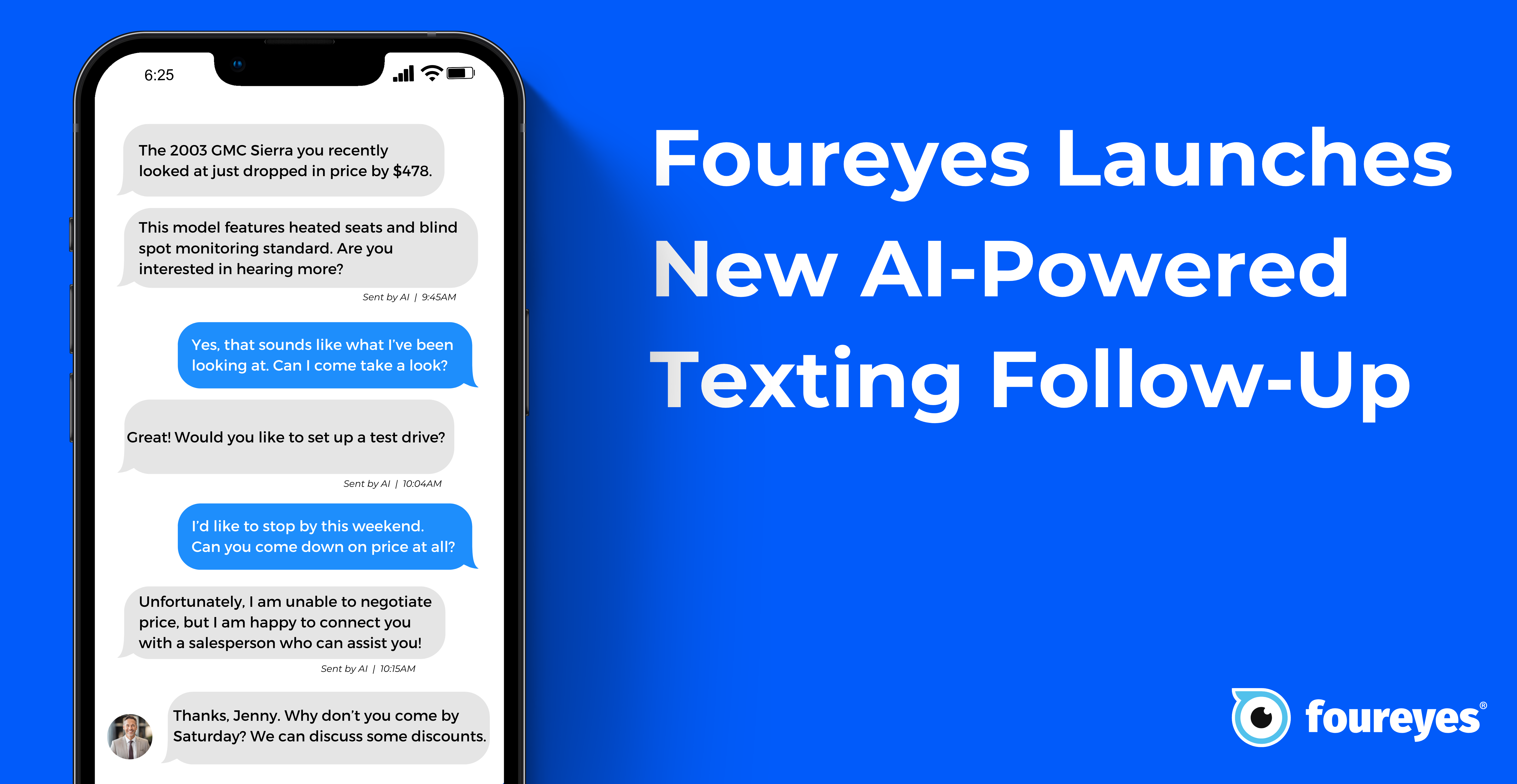 Foureyes Changing the Follow-up Game with Inventory-based Texting
See how the latest Foureyes innovation further helps dealerships match prospects to specific inventory.
 There are How Many “Hidden” Sales Leads at Automotive Dealerships?
New research of sales process data across U.S. automotive dealerships sheds light on the opportunity of “hidden” leads in dealership CRMs.
 How many leads do you actually need? And are you efficiently and effectively working them?
Which dials need to be turned, and how far, to ensure they are getting leads for inventory that actually need leads? And to ensure those leads efficiently and effectively worked?

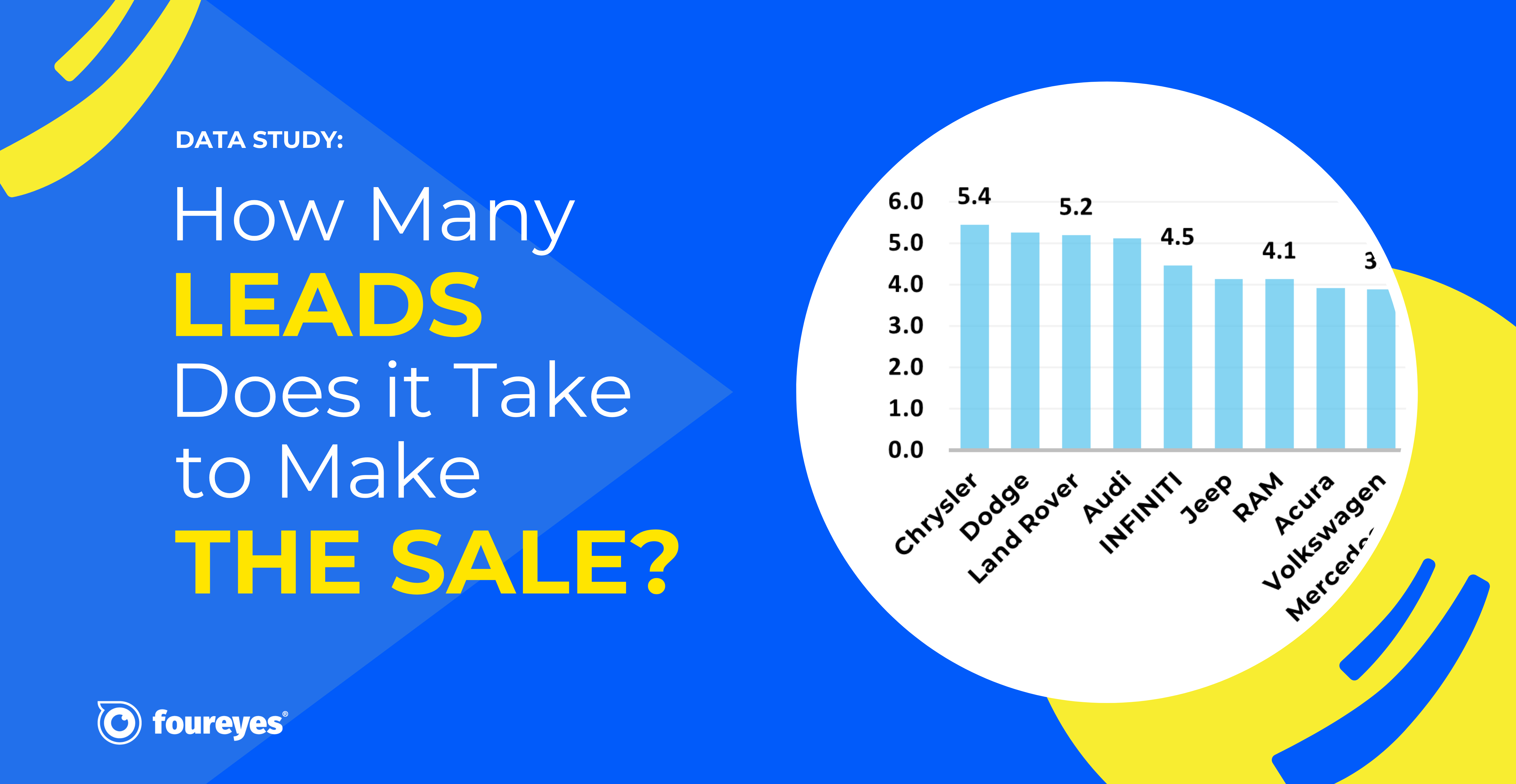 How Many Leads Does it Take for Dealerships to Sell a Car?
A Foureyes study of U.S. automotive dealerships identified the lead-to-sale “efficiency” across new vehicle inventory for Q1 2024.
 2024 Automotive Dealer Benchmarks Report
For the sixth consecutive year, Foureyes released its new automotive industry benchmarks. This data is intended to help dealers and dealer groups compare their performance against the industry and track trends in how leads behave.
.jpg)
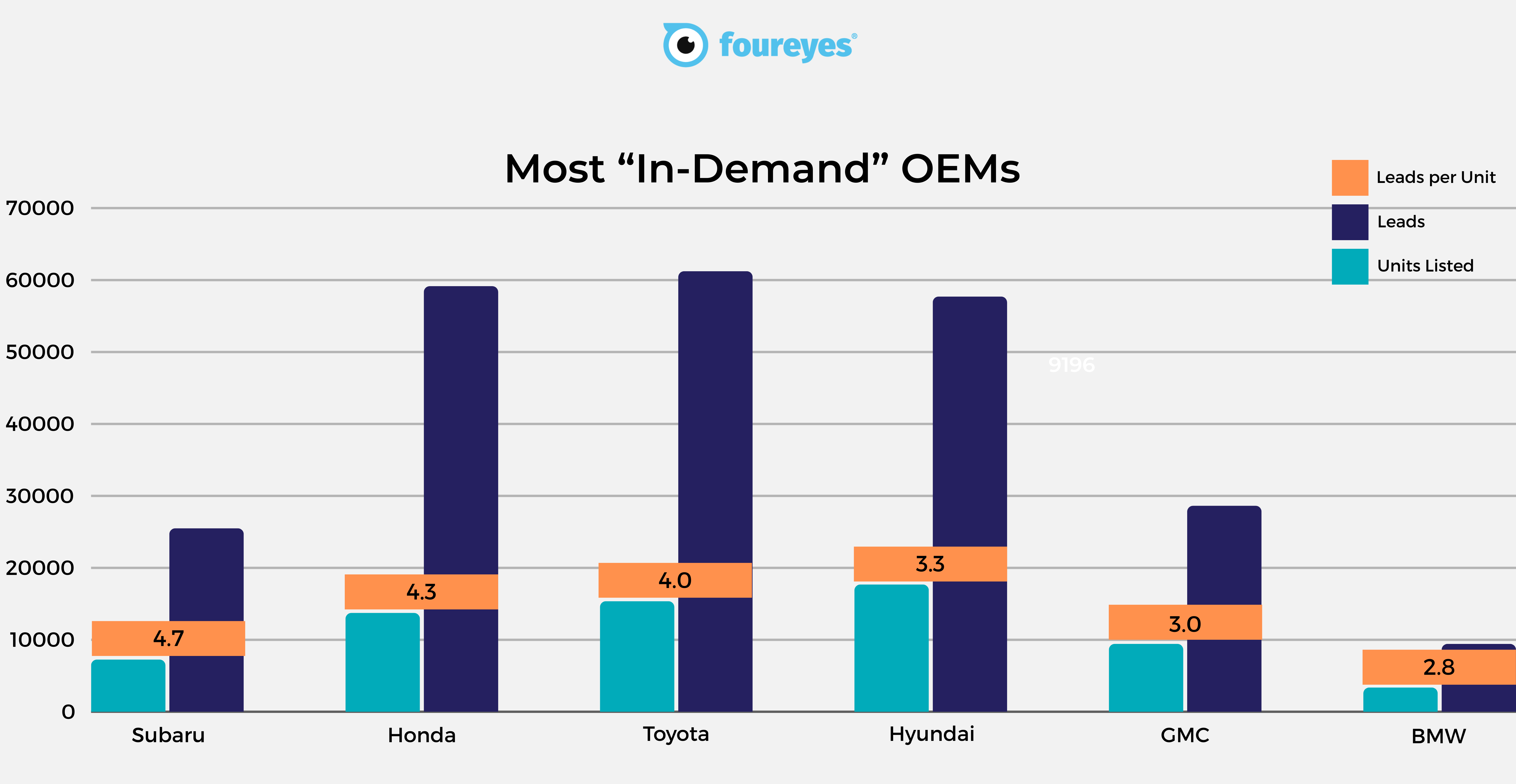 Most In-demand YMMs (2023 & 2024)
We dove into a pool of approximately 700 dealerships to scope out the most sought-after 2023 and 2024 YMMs and their OEMs over the past 3 months (min. 100 units per YMM)
.png)


 2022 Automotive Dealer Benchmarks Report
As automotive dealerships continue to adjust their strategies, tactics, and other process operations during this ongoing vehicle inventory shortage, we at Foureyes are sharing – for the fourth consecutive year – new auto industry benchmarks intended to help dealers understand the market, track trends in how leads behave, and drive sales success in 2022.


 2021 Automotive Dealer Benchmarks Report
For the third year in a row, we’re sharing auto industry benchmarks to help dealers and OEMs understand the market, track changes in customer behavior, and drive sales success in 2021.
 The 2020 Automotive Dealer Benchmarks Report
Start the new year off strong by reviewing your sales performance and creating 2020 goals. See how your dealership stacks up against the competition and use these auto industry benchmarks to develop a marketing and sales strategy for the new year.

